Home / Services / Responsive Web Design
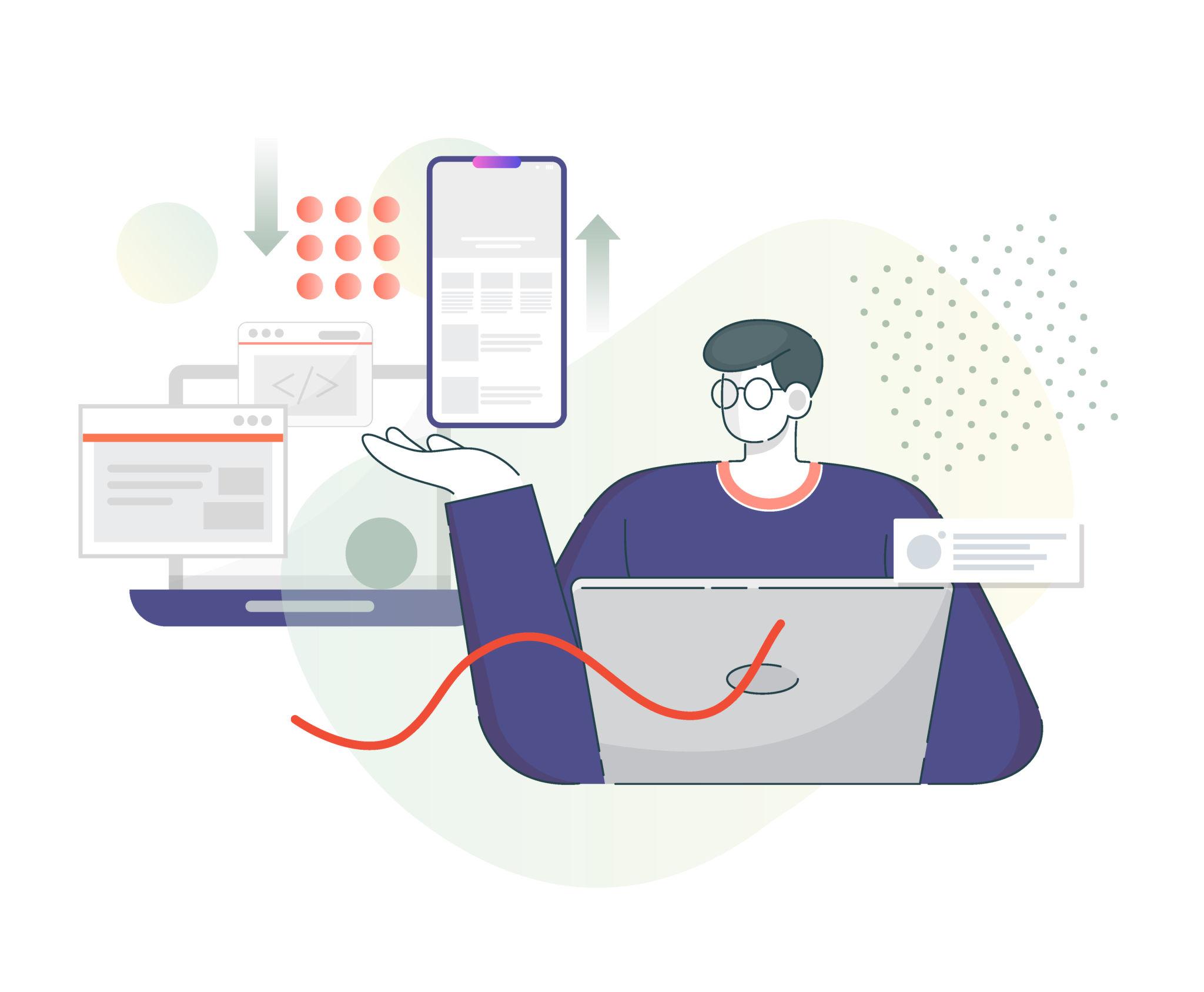
At Aashtech Innovation, we provide professional responsive web design services for businesses that want their websites to perform beautifully across desktop, tablet, and mobile devices. In today’s digital environment, users visit websites from many different screen sizes, and a responsive design ensures your business presents itself professionally everywhere. Our design approach focuses on flexible layouts, mobile-friendly sections, user-friendly navigation, readable content flow, and visually balanced presentation across all devices. Whether you need a new responsive website, redesign of an existing site, or a modern interface optimized for multi-device browsing, we create web experiences that are smooth, attractive, and built for real-world users.
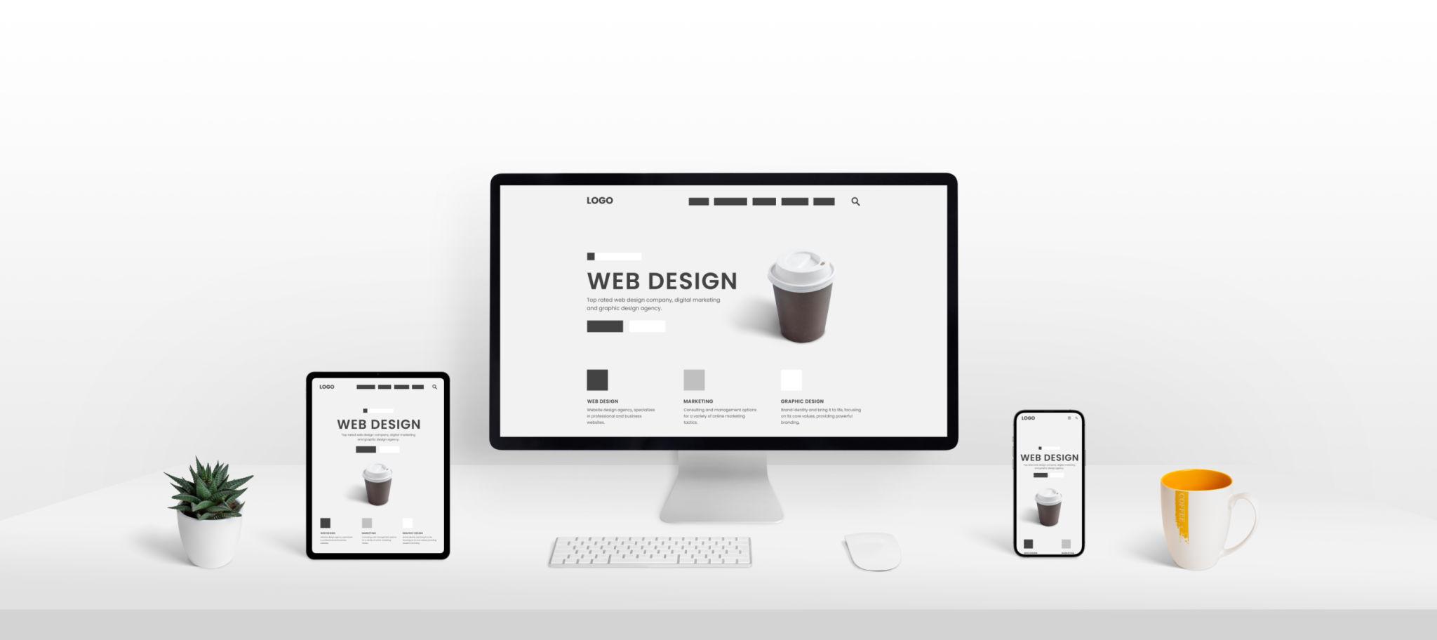
We create responsive websites that adapt smoothly to all screen sizes while maintaining strong branding, clean layout flow, and a better browsing experience.
We create layouts that are optimized for smartphones and tablets so users can browse, engage, and interact with your website without difficulty.
Website sections, images, spacing, and navigation are designed to adapt effectively across desktop, laptop, tablet, and mobile screens.
We build responsive page structures that maintain visual balance, readability, and smooth user flow regardless of screen resolution or device size.
Responsive design improves navigation, readability, and interaction by making website content easier to access and use on smaller screens.
Existing websites can be redesigned into responsive layouts that improve modern usability, visual presentation, and accessibility for all visitors.
We create responsive business websites, landing pages, corporate sites, and service platforms designed to look professional on every device.

Modern users expect websites to work smoothly no matter which device they use. A responsive web design helps businesses provide a better browsing experience, reduce user frustration, improve engagement, and create a more professional digital presence across all screens.
We follow a structured design process to make sure your website remains visually strong, easy to use, and effective across all major device types.
We understand your business, target audience, website purpose, and device usage needs before planning the responsive design approach.
We structure flexible page layouts, responsive sections, navigation flow, and visual hierarchy to support smooth multi-device performance.
Our team designs the website so that content, images, and interface elements adjust properly across desktops, tablets, and smartphones.
We review responsiveness, visual balance, usability, and screen adaptability to ensure the final design works effectively for real users.
Layouts designed to fit all major screen sizes smoothly
Contemporary visual design with multi-device usability
Better navigation and readability on mobile and desktop
Consistent visual presentation across different devices
Whether you need a new responsive website, mobile-friendly redesign, or business page layout optimized for all devices, our team can help you build a stronger digital experience.
Start Your ProjectWe design responsive websites that look professional, work smoothly on every device, and improve user experience across your digital presence. Our team is ready to create a design that fits modern browsing behavior and business needs.